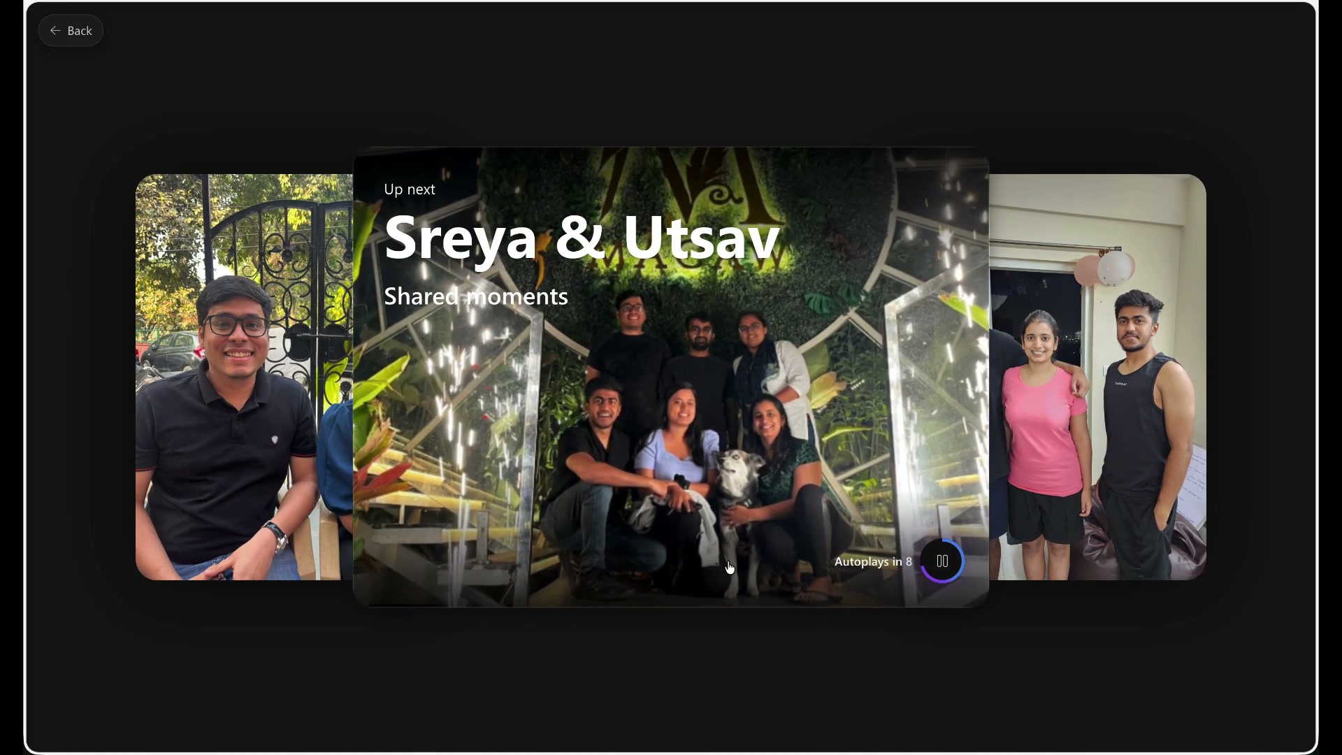
The photos are the memory.
The interface needed to create atmosphere without competing with the content. Photography should carry the emotional weight.
Some interactions could not load. The story, native video controls and full-size image links remain available.
OneDrive Photos / Slideshow
People don’t save photos just to store them. They save them because, someday, they want to feel something when they see them again.
The player clip could not load. Use the download link or follow the illustrated journey below.
01 / Designing for the feeling, not the feature
As OneDrive moved toward a more Photos-first consumer experience, we needed to understand what people wanted beyond safe storage.
Foundational research pointed toward reminiscing as an important job. People wanted memories to find them rather than always having to search. Story-like experiences from Instagram, WhatsApp, and Google Photos had also created familiar expectations around how memories could unfold.
But copying that format wasn’t enough.
A memory feels personal because of what it contains: the people, places, relationships, and moments inside it. No transition or visual effect could substitute for that connection.
That became the foundation for how I approached the experience.
02 / Before the screens, we needed a point of view
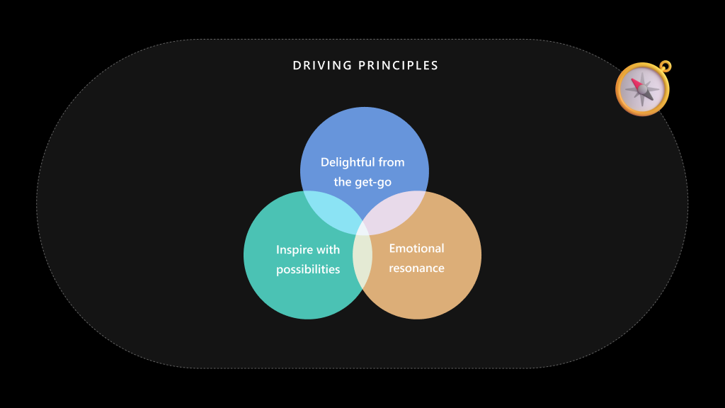
I set up foundational workshops with PM and design partners across web and mobile to work through the experience before narrowing into screens.
We explored what job Slideshow was actually doing, what people needed to feel in control, which interactions should feel immediately familiar, and where OneDrive had permission to do something different.
I also studied competing experiences in detail.
The goal wasn’t to simply benchmark features. It was to create shared context for our decisions: which conventions people already understood, where competitors created friction, what a viewer expected from playback, and where our own experience could have a stronger point of view.
From that work, a clear ambition emerged:
Make the default experience worth watching, then give people room to make it theirs without asking them to build a story from scratch.
03 / Designing an experience we could grow into
I worked with product to shape the ambition into a crawl, walk, run plan.
The useful part wasn’t the terminology. It was agreeing on what each phase needed to accomplish and being disciplined about what could wait.
This helped us keep the first release focused without designing it into a corner.
This was the planning framework, not a claim that every later-phase idea shipped. I kept the near-term experience and the longer-term ambition distinct.
04 / Designing for the web canvas
Web gave us significantly more real estate to work with.
The temptation with a larger canvas is to fill it. More navigation. More actions. More persistent controls.
We went the other way.
I wanted the active photo to command the experience, using the additional space to create presence and immersion while keeping orientation and control within reach.
That led to a simple hierarchy:
This gave Slideshow a very different rhythm from the surrounding photo library.
It could feel cinematic without becoming a black box. Someone could lean back and watch, but the tools to pause, explore, or change direction were never far away.
The discovery recording could not load. Use the download link or explore the screenshots below.
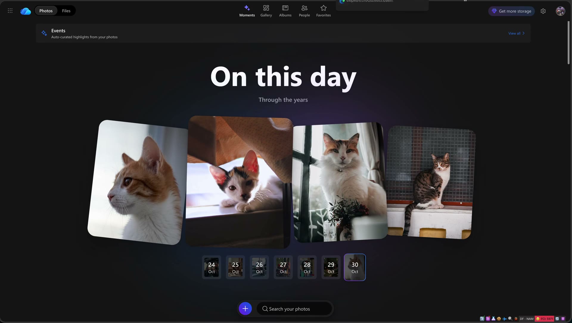
01 / Discovery
Moments offers several reasons to return: an event, a date, a recent period or an unexpected connection. I aligned the slideshow entry with these existing memory surfaces rather than creating another place people had to find.
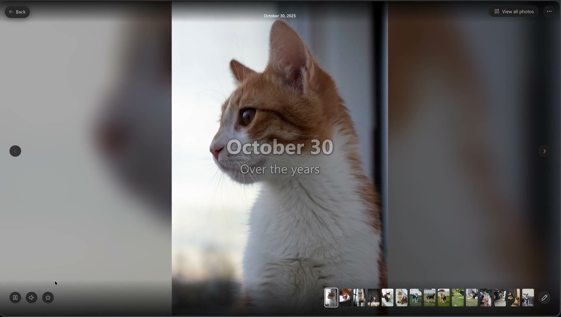
02 / Slideshow open
The player gives the photos room, while the title and date help locate the memory. Playback controls and View all photos stay close enough to act on without turning the experience into a toolbar.
The photo-collection clip could not load. Use the download link or read the step description.
03 / View all photos
A static collection lets people inspect what went into the slideshow and spend longer with an individual photo. The memory’s context stays visible, rather than dropping them into an unrelated gallery.
04 / Edit the collection
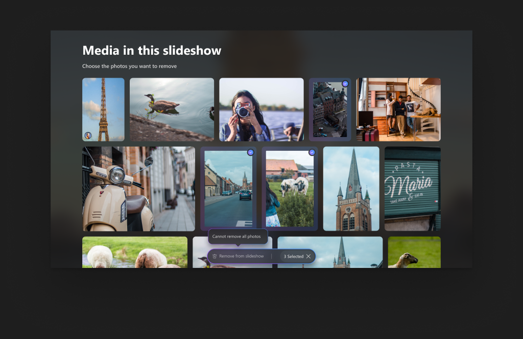
The selection state makes the action specific: remove from this slideshow. A visible count and an empty-selection guardrail help make the consequence clear. This was the direct design response to a photo that makes a memory uncomfortable or too personal to share.
The return-to-playback clip could not load. Use the download link or read the step description.
05 / Back to the slideshow
Inspecting the photos shouldn’t mean starting discovery again. The collection and player are connected views of the same memory, so people can move between looking closely and letting the story unfold.
The Play next clip could not load. Use the download link or read the step description.
06 / Re-engagement
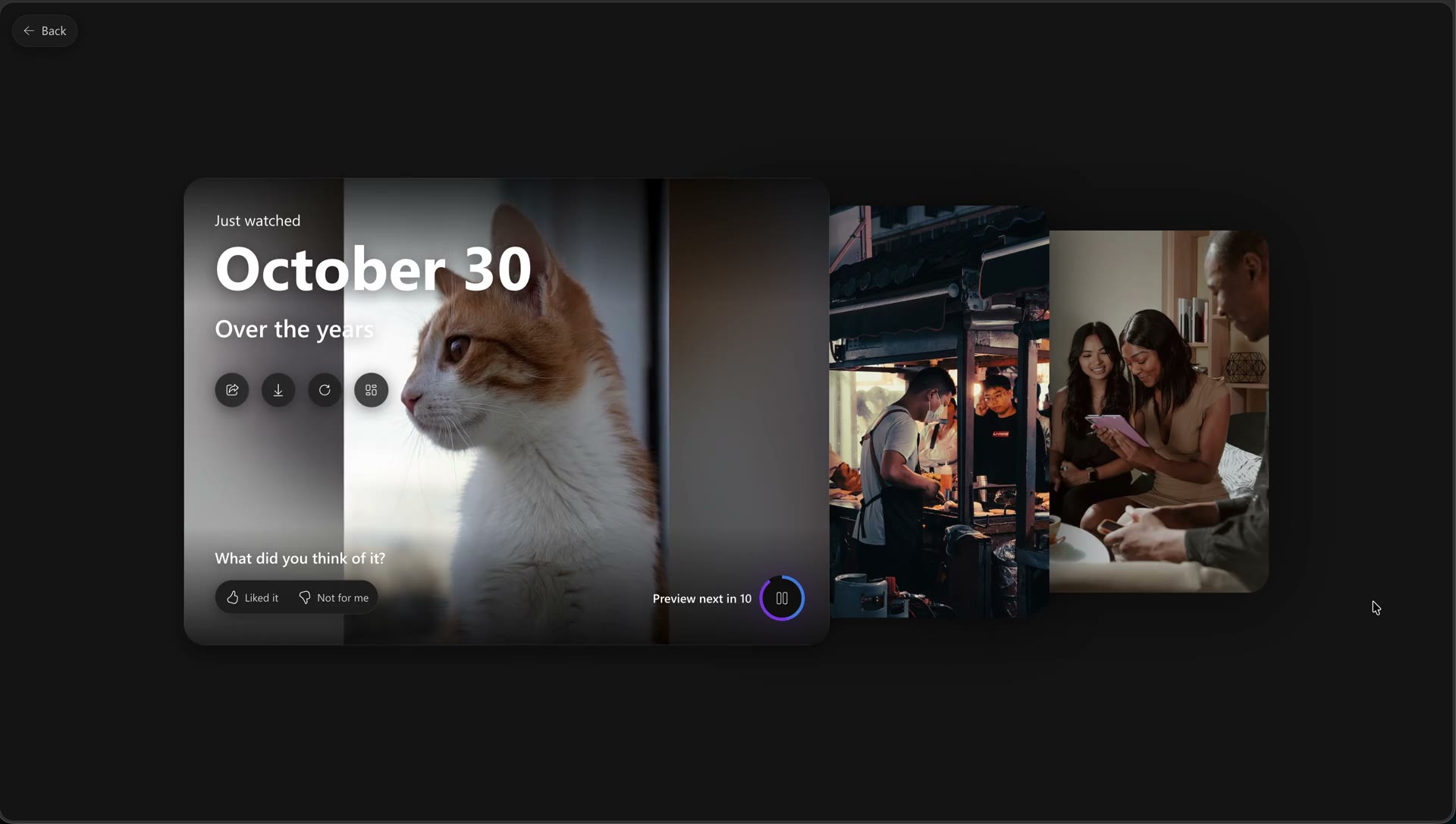
Play next offers another memory without sending people back to the landing page. The preview and countdown make that transition visible, rather than changing the subject without warning.
05 / The filmstrip became the bridge
A slideshow naturally asks people to move forward.
Memories don’t always work like that.
You might want to go back to the expression you noticed two photos ago. Jump ahead. Pause on a particular image. Or simply understand how much more of the memory there is to see.
The filmstrip gave the sequence shape.
It showed where someone was, hinted at what was coming, and let them move directly through the collection without pulling them out of the experience.
That meant carefully balancing its visual weight.
Make it too prominent and Slideshow becomes another gallery. Hide it too aggressively and people lose orientation and agency.
So I treated the filmstrip as a secondary layer of the memory: available when useful, visually connected to playback, but never competing with the active photo.
The larger web canvas made that balance possible. We could expose more of the sequence while still allowing the current image to feel expansive.
06 / Put controls where the intention lives
The player needed to accommodate people who wanted to press play and lean back, as well as people who wanted to actively navigate the memory.
That meant I didn’t approach controls as one generic toolbar.
I organised them around the intention they served.
The goal wasn’t to hide functionality.
It was to make the interface understandable through placement, hierarchy, and consequence, so people didn’t have to decode what each control was going to change.
07 / Change the pace without leaving the memory
Playback is only one way of experiencing photos.
Sometimes something catches your attention and you want to stop. Sometimes you want to see everything that was included. Sometimes you want to spend longer with one photograph.
So I designed a static collection as another view of the same memory, rather than a route back into the general photo library.
The title and context remain. The relationship to the slideshow remains. And crucially, the path back to watching remains.
That distinction sounds subtle, but it mattered.
I didn’t want someone to feel like they had exited Slideshow just because their intention had changed from watch to look.
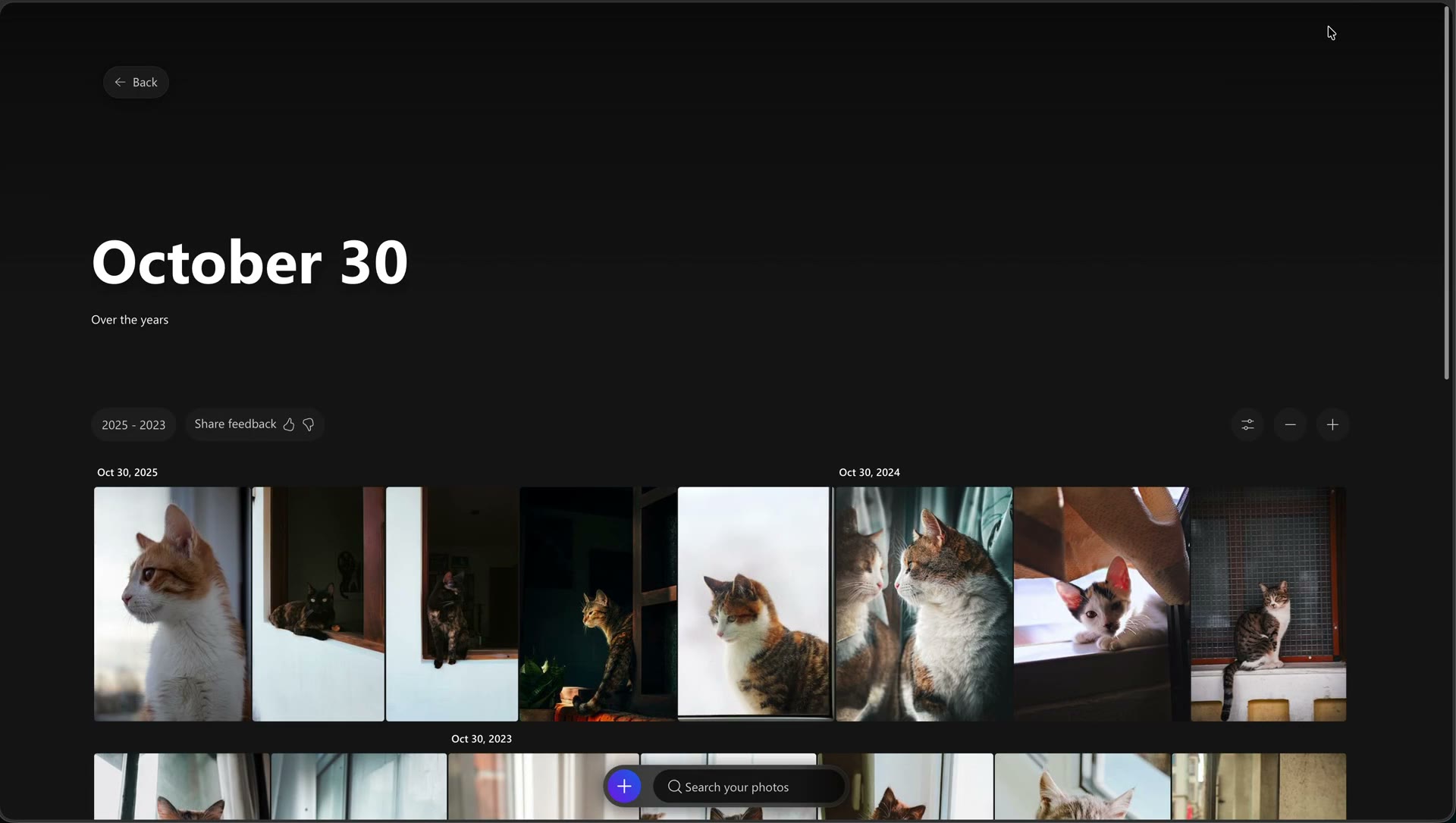
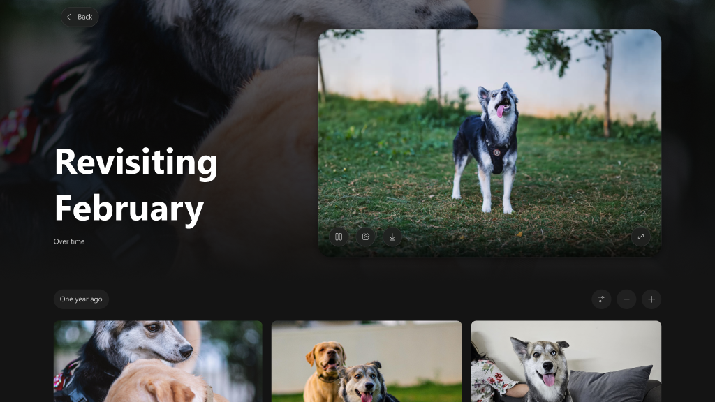
The photo-viewing prototype explores the same relationship from another direction: keep the memory title, the playable story and the underlying collection together. It helped make the connection between watching and browsing explicit.
08 / Give people control over what belongs
This was one of the most important research insights to carry through the design.
Someone might love 19 photographs in a memory and deeply dislike the twentieth.
It could feature someone they no longer wanted to see. It might expose something too personal. It could simply be a bad photograph.
That single image could change whether the entire memory felt watchable or shareable.
The editing experience therefore focused on a very specific promise:
Remove from this slideshow.
Not delete from OneDrive.
Not open a sophisticated editor.
Not rebuild the memory.
Just give someone enough control to say: this doesn’t belong here.
Selection states made the scope visible. A count clarified what would change. Guardrails prevented an empty selection.
It was lightweight editing by design, because the intention wasn’t creation.
It was ownership.
09 / Design the way back
Moving from playback to the collection was only useful if people could comfortably return.
The filmstrip, static collection, and player therefore weren’t designed as separate destinations.
They were different ways of engaging with the same memory:
That continuity allowed someone to shift their attention without losing context or returning to Moments to rediscover the same memory.
10 / The last photo shouldn’t be a dead end
We spent a lot of time thinking about what happens after the last photo.
Because ending a slideshow with a replay button would have solved playback, but missed the larger opportunity.
At that moment, someone has just spent time in a memory. They may want to respond to it, replay it, share it, or continue.
I separated those intentions into an end experience with its own pacing:
Each stage has a different job.
That separation stopped the experience from feeling like one endless feed of photographs.
One memory gets to end before another one begins.
11 / Play next without taking control away
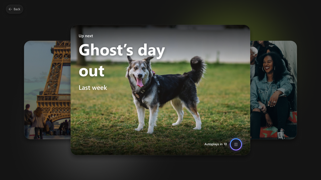
Play next gave us a way to turn one memory into the discovery of another.
But that came with an important design tension.
Automatically jumping to another memory could increase engagement, but memories can carry very different emotional weight. Switching abruptly from one to the next could feel less like discovery and more like the product changing the subject.
So I designed the transition to be visible.
A preview tells you what is coming.
A countdown tells you when.
The viewer has an opportunity to continue or choose something else.
Play next becomes an invitation rather than an invisible product decision.
And because the transition happens within the experience, people don’t need to return to the Photos landing page and begin discovery again.
The end of one memory can naturally become the beginning of another.
12 / Variety between memories. Consistency within one.
A slideshow is a sequence, not a stack of screens.
Pacing, music, transitions, cropping, timing, and photo treatment all influence how the memory feels.
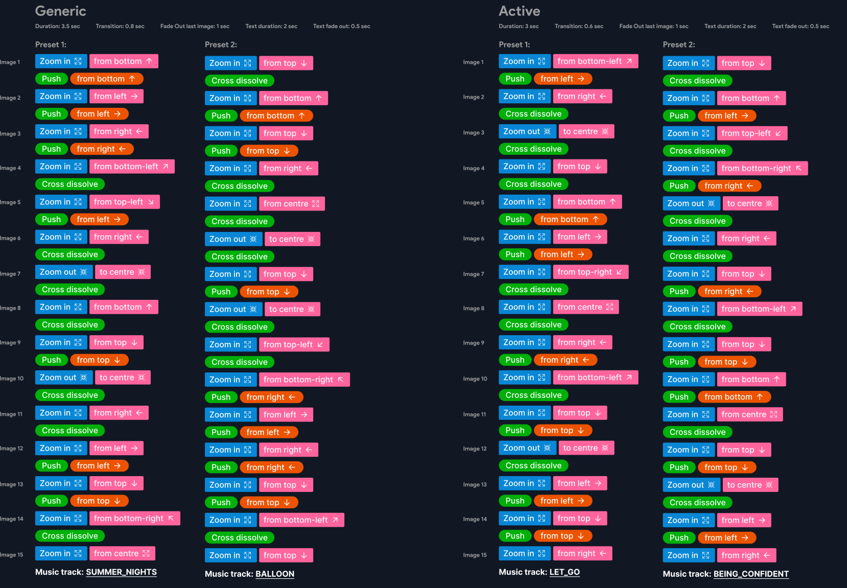
We explored dynamically assembling effects through heuristics. That created variety, but it also introduced unpredictability.
Returning to the same memory could result in a different story.
So we moved toward authored presets.
Each preset defined the behaviour of the sequence, giving us variety across different memories while keeping an individual memory consistent.
The categories also gave design, product, motion, and engineering a shared vocabulary for the feeling we were trying to create.
13 / Make motion something we can agree on
Static mockups couldn’t fully communicate Slideshow.
A transition beginning 100 milliseconds earlier or an image disappearing before the next was ready could materially change the experience.
At the same time, a polished prototype could disguise the mechanics engineering needed to reproduce.
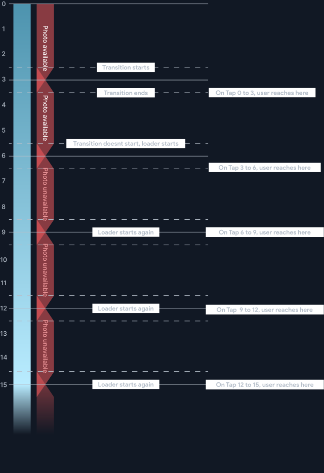
So we used timeline-like specifications to make time explicit:
That last part was especially important.
Loading, interruption, and recovery are part of motion design too.
If the next photo isn’t ready, the right experience isn’t an empty frame. Hold the current image. Preserve continuity. Recover gracefully.
I worked closely across motion and engineering to connect those details back to the overall design intent rather than treating animation as a final layer added after the experience was solved.
14 / The details between teams become the experience
As we moved toward delivery, I contributed beyond the main interaction flows into the edges and dependencies connecting Slideshow, Moments, and Albums.
These questions are easy to dismiss as specification details.
But collectively, they determine whether an experience feels considered or merely designed for the demo.
My role was to keep connecting those details back to the outcome, clarify trade-offs across design, PM, and engineering, and keep the experience coherent as it moved from concept to implementation.
15 / More watching. More to learn from.
The initial engagement signals were encouraging:
A separate usage snapshot gave us another view into scale and response:
| Slideshow events | 9.25M |
|---|---|
| Month-over-month growth | 2% |
| Completion | ≈58% |
| Structured feedback | ≈500/day |
| Likes / dislikes | ≈12K / 1.1K |
Slideshow events represent usage events, not unique people. Structured feedback represents submissions, not the total viewing audience.
These signals helped us look beyond whether people entered Slideshow and begin asking better questions about completion, sentiment, performance, and what should evolve next.
Shipping wasn’t the end of the design loop. It gave us a new way to learn.
These figures were supplied as reported results, without their measurement window or cohort. The event, completion and feedback measures have different denominators and are not combined into a single success rate.
The outcome
It’s that the pieces work as one experience.
Together, those decisions changed Slideshow from a playback feature into a way of spending time with the memories already inside OneDrive.
Because ultimately, we didn’t need to make the photos more meaningful.
They already were.
We needed to design the space around them so people could feel that meaning again.
The photos were already worth keeping.
We designed a reason to come back to them.
Keep exploring