Photo editing used to be predictable. Crop a photo, move a brightness slider, apply a filter: the change was bounded. Generative AI could interpret, improvise and sometimes surprise us.
I helped define what AI editing should make possible, how much freedom it should have, and how we could tell whether the experience was keeping its promise.
My role
Product framing, interaction design, live prototyping and hands-on model evaluation.
Collaboration
Engineering, design and PM.
Focus
Fix, Imagine and Restyle; photo-first layouts; progressive control; intent-led evaluation.
The winter scene clip could not load. Download the clip or continue with the story below.
TL;DR / Overview
Problem
Define what AI should be allowed to change, then make that freedom understandable without losing the person’s photo or intent.
My contribution
I explored the possibility space, helped shape Fix, Imagine and Restyle, and designed whole-photo and precision-editing behaviours through a live prototype.
Design principles
Keep the photo central, use suggestions to teach prompting, and put direct-manipulation controls beside the image.
Evaluation
Hands-on zero-prompt testing across evolving models, with intent-specific quality rubrics, representative photos, human judgment and separate safety evaluation.
Result
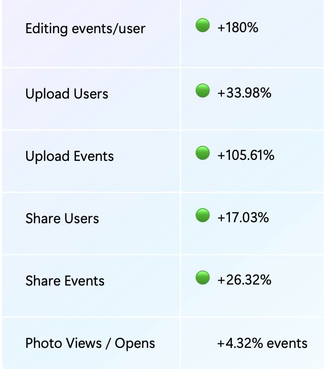
Across the broader Photos Edit experience: editing events per user +180%; upload users +33.98%; upload events +105.61%; share users +17.03%; share events +26.32%; photo view/open events +4.32%.
01 / Before the interface
What should an AI photo editor make possible?
I scoured emerging capabilities, existing photo-editing behaviours and model experiments, then brought the team together to map what was genuinely useful in Photos. The goal wasn’t a list of flashy features. It was the need behind each one.
Emerging capabilitiesWhat is becoming possible?
Editing behavioursWhat do people already need?
Model experimentsHow do the outputs behave?
What are all the ways someone might actually want AI to change their photo?
Before designing the interface, we defined the possibility space.
A spectrum from corrective to creative.
A better version of the photo at one end; a complete transformation at the other. Between them was a much larger territory: reimagining reality without losing it.
Correct reality→
Reimagine reality→
Transform reality
The behaviour of the output gave us the IA.
Working with the models brought one dimension into focus: how far is the AI allowed to move away from the original photo? The answer gave us three product spaces, each with a different promise.
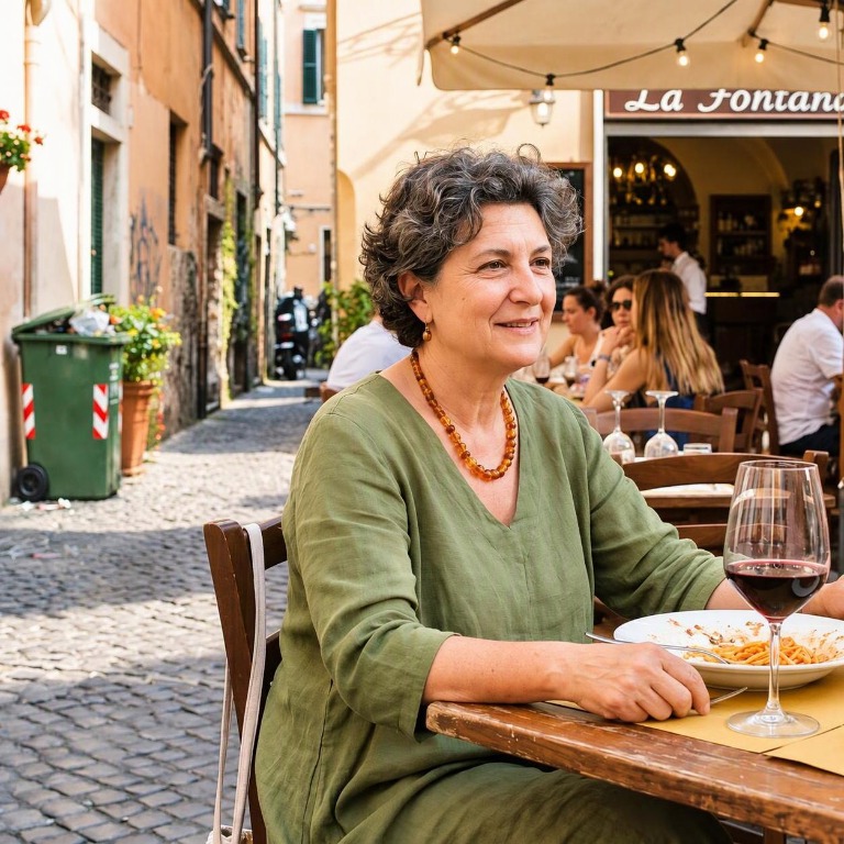
Fix / Preserve
Make this better without making it different.
The cafe portrait stays photographic. The edit is about improving light and clarity, not inventing a new scene.
The intent is faithful improvement, not an unexpected reinterpretation of the person or scene.
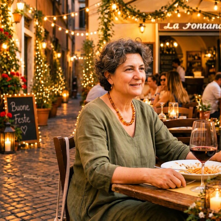
Imagine / Reimagine
Change reality, but preserve me.
The cafe becomes a candlelit, plant-filled setting. The surroundings change, while the person stays photographic and recognisable.
There is more creative freedom, but the result should feel photographically believable. If I’m in the picture, I should still look like me.
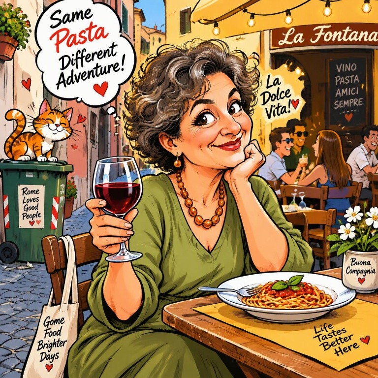
Restyle / Transform
Make transformation the point.
The cafe portrait becomes a comic illustration, reinterpreting both the person and the world around her.
The model has permission to reinterpret the scene and the person within it. Changing the visual representation is what the person came for.
Fix, Imagine and Restyle weren’t arbitrary navigation buckets. They represented increasing creative freedom. New capabilities could find a place by their intent, rather than by the model powering them.
The same framework would later answer two questions: where does this capability belong, and what does “good” mean when we evaluate its output?
02 / The photo is the point
Keep the thing they care about front and centre.
AI interfaces naturally want to fill themselves with prompts, suggestions and controls. But people care about their picture, not our AI interface.
They need room to notice what changed and decide whether it still feels right. The interface should adapt to the image, not make the image compete with it.
03 / Intent and direct manipulation
When I select the photo, meet me there.
The two sides of the editor had different jobs. The panel held the intent; the area around the image held the actions for working directly on the photograph.
When attention moves from composing an instruction to selecting an object, the interface should meet the person at the image. The panel can stay focused on what AI should do with that selection.
This isn’t chat with a photo attached.
AI had already made a familiar pattern of prompt at the bottom, response above, then prompt again. But we weren’t designing a conversation. We were editing a photograph.
I placed the prompt at the top of the editing surface. A small layout decision carried a bigger statement: this is a photo editor that happens to understand language.
An extra step that teaches.
Knowing you want a warmer sunset is not the same as knowing how to prompt for one. Zero-prompts became more than shortcuts: they were a way to make the system learnable.
Winter scene
01Choose a suggestion
Start with a visual direction.
Prompt preview
Turn this into a winter scene.
02See the prompt
Read how to ask for the change.
03Send it
The person makes the final call.
Conceptual flow; prompt wording is illustrative. Choosing a suggestion does not immediately start generation.
Usually I try to remove steps. Here, revealing the prompt before sending did useful work: this is how you can ask AI for something like this.
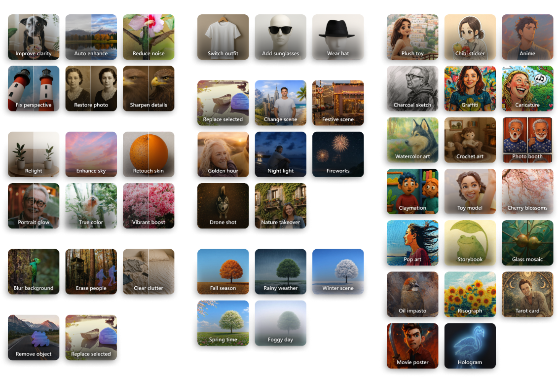
The small pictures carried the invitation.
The thumbnails had to be fun, illustrative and immediately understandable. They also had to work as a collection.
I looked across race, age, gender, subject matter, zoom and framing, colour and photographic composition. It wasn’t enough for one thumbnail to look great. The set needed to say: there is space for your kind of photo here, too.
That was one of the quieter, more enjoyable pieces of the work: making AI editing feel playful without making its invitation feel narrow.
04 / Progressively more control
When I care about where, give me control.
Train A: how much can AI do for me?
Whole-photo edits reduced effort. People could choose a visual suggestion or describe a change without needing to understand masks or segmentation.
Tell me what you want. I’ll figure out how to do it. The photo stayed in view while people explored a different style, scene or mood. But that simplicity had a limit: what happens when AI doesn’t know which thing you mean?
The whole-photo editing clip could not load. Download the clip or follow the description above.
Train B: I’ll show you exactly where.
“Remove the person.” Which person? “Replace that lamp.” Which lamp? More sophisticated prompting isn’t always the answer. Sometimes direct manipulation is.
People first marked an area, then chose what to do with it. Brush and selection added precision without asking language to do everything.
This is where the panel-and-canvas relationship mattered. The prompt held the intent; the canvas held the precision. Contextual controls stayed beside the image, while the panel changed to actions for that area.
The selected-area editing clip could not load. Download the clip or follow the description above.
Then let people judge the change.
There may be several good answers, so the prototype couldn’t stop at prompt and output. I built it to return alternatives, compare them, revisit previous generations and save a chosen result as a copy.
Built with Figma Make and Azure endpoints, the production-like prototype combined live transformations, responsive layouts and prompts for mood, lighting and palette. It let us align interactions and work with research on real outputs before engineering investment.
Which result preserved the person? Which went too far? Which was technically valid but emotionally wrong? Those conversations became central to evaluation, and the prototype became a reusable testbed as the models changed.
The result review clip could not load. Download the clip or follow the description above.
05 / A large part of the work
Designing for delight in a world without correct answers.
Traditional usability evaluation asks whether someone could complete the task. AI needed another layer: two generated images can both follow the instruction, and one can still feel completely wrong.
That matters when the subject is someone’s child, partner, parent or friend. A visually beautiful result can fail if the person in it becomes unfamiliar.
I actively participated in model evaluations, particularly zero-prompt behaviour across evolving models. We had to move beyond “does this look good?” without pretending that subjective judgment had suddenly become objective.
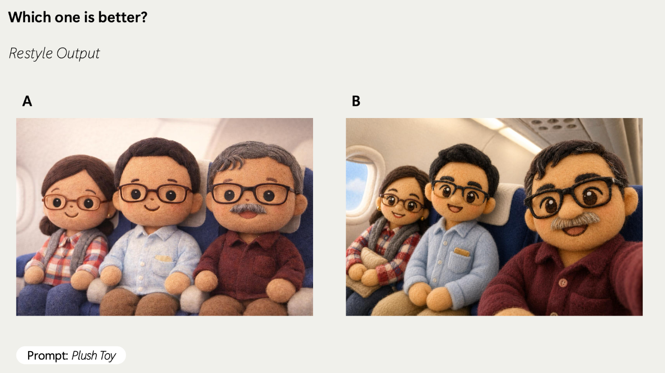
Which one is better? The same “Plush Toy” prompt produces two plausible answers. The comparison needs criteria, not just a favourite.
Turning taste into something we could discuss again.
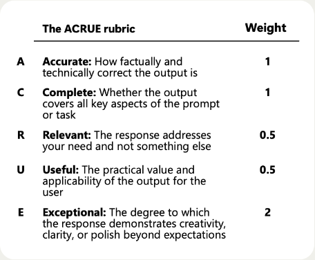
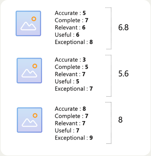
The aim was to make judgment structured enough to repeat. ACRUE gave us five lenses: accuracy, completeness, relevance, usefulness and exceptional quality. But the weights and expectations needed to follow the editing intent.
The promise in the interface becomes the bar for the output.
FixPreserve
Reward fidelity. Faithful improvement, not unrequested creativity.
ImagineReimagine
Balance change with realism. A different scene; recognisably the same person.
RestyleTransform
Make room for expression. Creativity matters, alongside recognisability.
The UX taxonomy and the quality taxonomy started speaking the same language. Different creative promises required different definitions of quality.
The rubric below is one zero-prompt-quality example, not a universal scoring rule. Representative photos, carefully developed prompts and repeatable reviews let us compare models without choosing whichever demo happened to look best.
The zero-prompt evaluation process
01 / Define the bar
Choose the rubric for the output.
Agree on criteria and weights before grading. In this example, “Exceptional” carries the most weight.
One rubric: zero-prompt quality
Dimension
What we look for
Weight
Accurate
Factual and technical correctness.
1
Complete
Whether the output covers the prompt or task.
1
Relevant
Whether it addresses the intended need.
0.5
Useful
Practical value for the person using it.
0.5
Exceptional
Creativity, clarity or polish beyond expectations.
2
02 / Represent real photos
One impressive photo is not a test set.
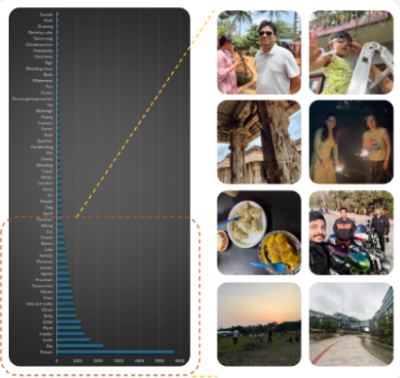
Use tag analysis to represent real OneDrive photos, rather than a few hand-picked successes.
03 / Develop the prompts
Make the first set of choices.
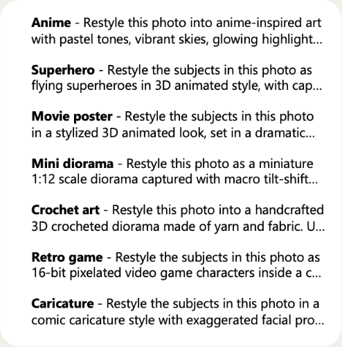
Study useful patterns and build the first zero-prompt choices. Simple suggestions still need carefully developed prompts.
04 / Generate the combinations
Test the matrix, not a favourite.
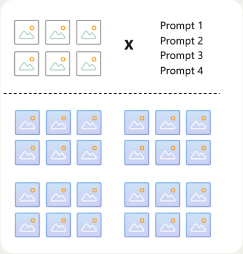
Cross N images with M prompts. Each style must work across the set, not just one photo.
05 / Grade with the rubric
Bring human judgment into the scores.
Grade each image-prompt pair against the chosen rubric, using model-based and human judgment.
06 / Compare at prompt level
Look for quality across the set.
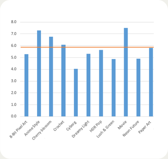
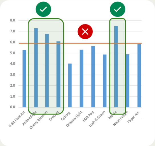
Collate each prompt’s scores to check consistency across the photo set, not just its best result.
07 / Retune or replace
Use the results to make the next decision.
Retune prompts below 6. If tuning does not help, remove the prompt and try another.
Scroll to the next step. Each point settles in place; select an image to inspect it at full size.
One output. Two different questions.
Quality / Realistic edits
What changed that shouldn’t?
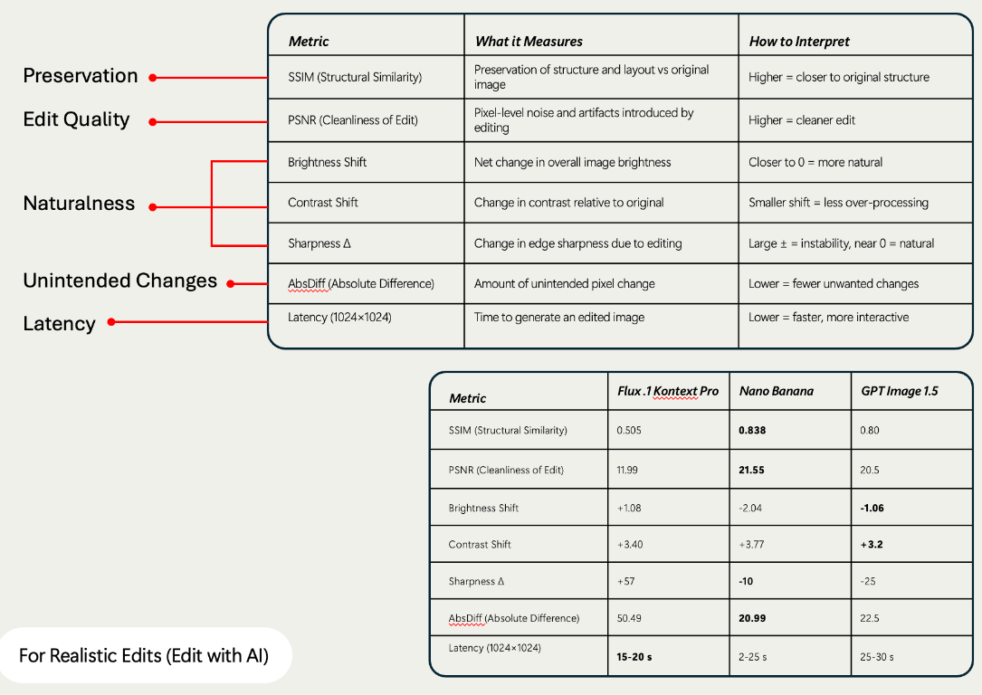
Structure, cleanliness, brightness, contrast, sharpness, unintended changes and latency all mattered. SSIM, PSNR and absolute difference were signals, not substitutes for intent.
A deliberate transformation and a subtle correction do not ask for the same preservation. A more impressive output can still be slower, less faithful or further from what the person wanted.
Safety / Responsible AI
Was the allowed output appropriate?
Safety had a separate 1,000+ image set crossed with prompts across harm categories. We reviewed blocked and allowed outputs, including photos of minors, for age appropriateness and unintended body or clothing changes.
A block rate tells us what the system stopped. It does not tell us whether everything it allowed was appropriate. Fallback behaviour and human review still mattered.
Human judgment stays in the loop.A beautiful output is not automatically a safe one.
See the realistic-edit diagnostic snapshotA snapshot from the evaluation work, not a current model ranking. The scoring context and intended edit matter.
Evaluation became a product capability of its own.
What began with people manually examining outputs grew with every new model, prompt, photo set and safety scenario. Repeating the work needed more than another spreadsheet.
The broader Photos evaluation work evolved into a platform with reusable criteria, generation workflows, automated judging, face-comparison signals, safety checks and reports that preserve the reasoning behind scores. Human review stays in the loop, especially for subjective or identity-sensitive judgments.
The platform has its own story in Is this good enough? Here, the important change was the feedback loop.
Design with the outputs, not just for them.
01DesignDefine the promise.
02GenerateWork with real outputs.
03EvaluateApply the right rubric.
04UnderstandFind where the promise broke.
05ImproveThe model, prompt or interaction.
06Run it againBring the learning back.
Every review informs the next design decision.
Evaluation isn’t the gate at the end. It becomes part of design.
My contribution wasn’t just a set of editing controls. It was helping define how AI editing should behave, how people should understand it, where control should increase, and how to judge whether it was living up to that intent.
Start with what people care about. Give AI freedom where freedom creates delight. Give people control where control creates trust. Then evaluate the experience against the promise we made.
The broader Photos Edit experience
A wider view of the impact.
These reported changes belong to the broader Photos editing experience, not to AI Edit alone.
Editing events per user
+180%
Upload users
+33.98%
Upload events
+105.61%
Share users
+17.03%
Share events
+26.32%
Photo view / open events
+4.32%
Relative changes from the reported Edit metrics. The comparison baseline, cohort and timeframe were not supplied. These are not percentage-point changes or a causal estimate for AI Edit. View the original metrics.
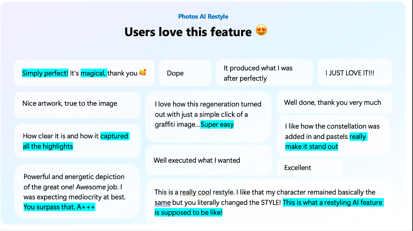
Delight. Simplicity. Fidelity.
“Nice artwork, true to the image”
“Super easy”
“This is what a restyling AI feature is supposed to be like!”
Selected comments from the feedback summary reflect the sentiment around simplicity and differentiation. They are not a survey distribution. View the feedback summary.