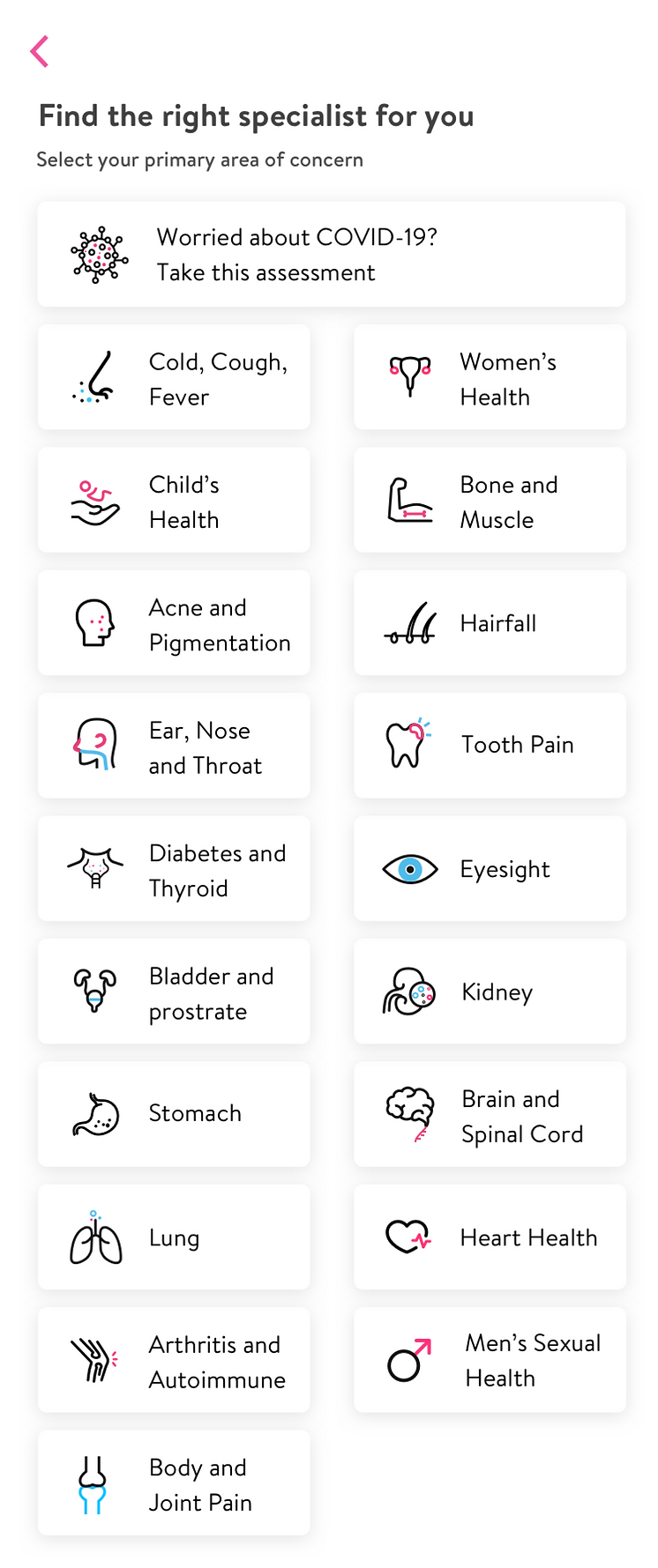
01 / START WITH THE NEED
You know what feels wrong.
Not always who to see.
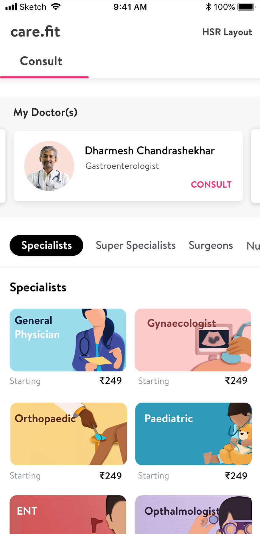
I connected symptoms to suitable consultations through plain-language guidance and speciality descriptions.
Some interactions could not load. The story and full-size image links are still available.
CARE.FIT / 2019–2020
When clinics closed, care couldn’t stop. I led research and design to bring consultations online and connect the steps before and after each call.
Revenue uplift at tele-consultation launch.
Month-on-month revenue growth.
Increase in repeat consultations.
48.3% monthly AOV increase
27.8% monthly CVR for COVID-19 packs
3.74 consultation rating
Six-month service-level results, not evidence of individual UI effects. Retained records omit full baselines and the rating scale. AOV is average order value; CVR is conversion rate.
01 / THE CONTEXT
COVID-19 halted on-ground consultations and diagnostics. Moving care online meant more than adding a video call.
Care.fit offered doctor, nutrition and lifestyle consultations; check-ups, diagnostics, skin and hair services; at-home sample collection, medical records and follow-up care.
I owned research and design across the patient app and doctor’s EMR, partnering with the PM on direction and engineering on delivery.
Patients still needed answers: Who should I see? Can I trust them? What happens after the call?
I adapted offline workflows, protected clinical context and worked within existing infrastructure, leaving room for feedback after launch.
02 / THE EXPERIENCE
Each screen helped patients find care, weigh their options, consult and follow up. Explore the decisions along the journey.
01 / START WITH THE NEED
I connected symptoms to suitable consultations through plain-language guidance and speciality descriptions.
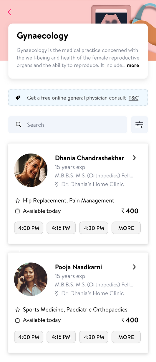
02 / MAKE TRUST VISIBLE
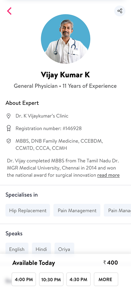
I surfaced credentials, registration, expertise and availability. Hospital-chain doctors alongside independent practitioners added another trust signal.
03 / FIND A TIME
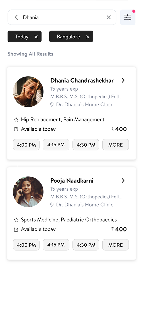
I kept available times beside the doctor’s experience and fee, with filters for day and location. Patients could compare options without opening every profile.

04 / MAKE THE CONNECTION
Patients could choose audio or video; I used Twilio for cost-conscious in-app calling alongside appointments and one-to-one chat.
05 / KEEP THE CONTEXT
I kept the same doctor, history and reminders within reach, connecting follow-up to prescriptions, diagnostics and medication delivery.
The connected call was only one state to design. Patients also needed a choice of mode, help with a weak connection, and a clear answer when a doctor was delayed or unavailable.
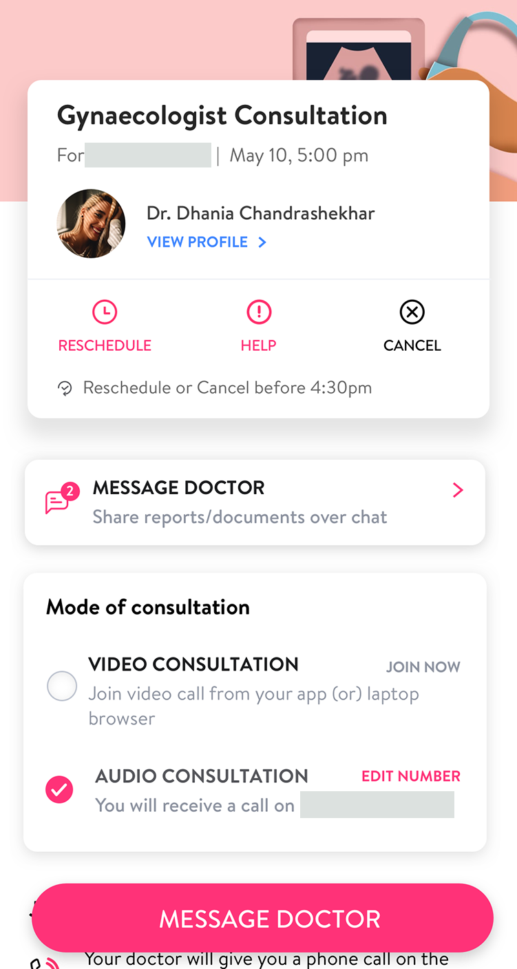
01 / AUDIO
The appointment screen offered audio as an explicit option and let patients update the number the doctor would call.
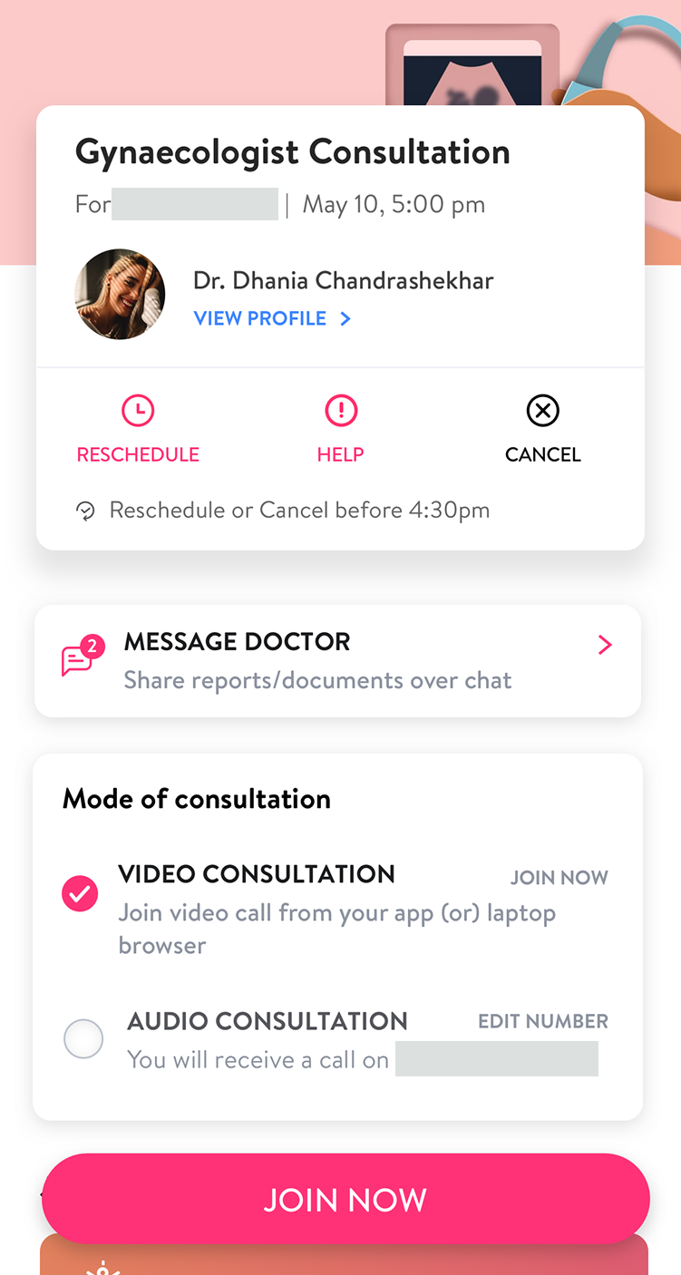
02 / VIDEO
The video state brought “Join now” into focus while retaining the appointment details, messaging and rescheduling options.
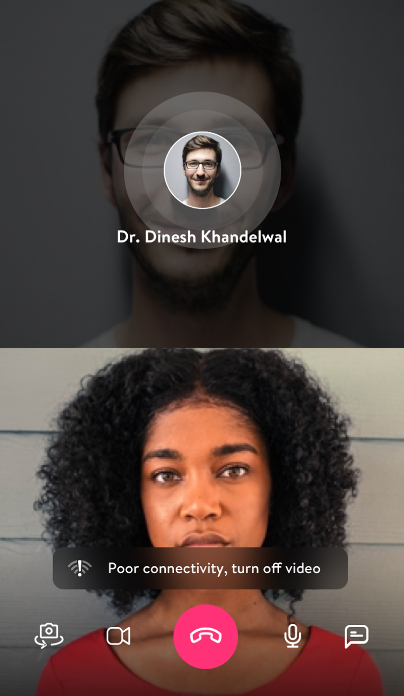
03 / CONNECTION
Rather than leave poor connectivity unexplained, the in-call prompt suggested turning off video. Camera, microphone, chat and end-call controls stayed in place.
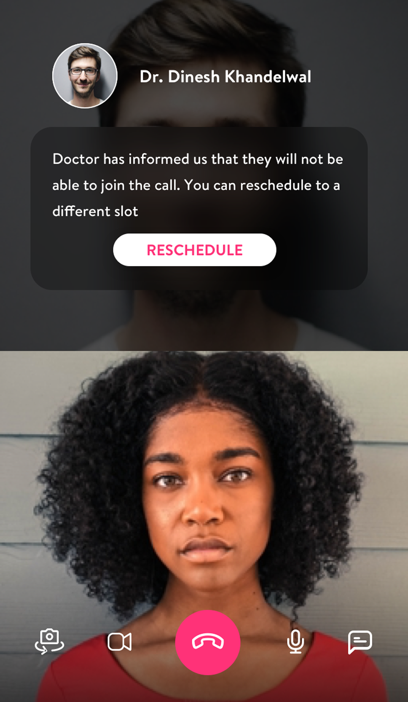
04 / UNAVAILABLE
This state explains the doctor’s unavailability and provides a direct reschedule action, rather than an indefinite waiting screen.
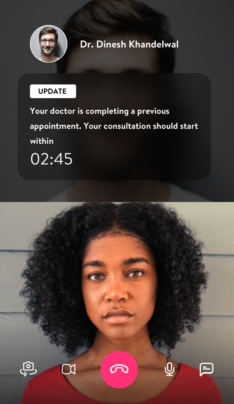
05 / DELAYED
A separate state says the doctor is finishing a previous appointment and shows an estimated wait. A delay and a cancellation shouldn’t look the same.

06 / CONNECTED
The connected state gives the doctor most of the screen, keeps the patient’s self-view small, and leaves essential call controls available.
Selected call states, not one consecutive consultation. Patient and contact details are masked.
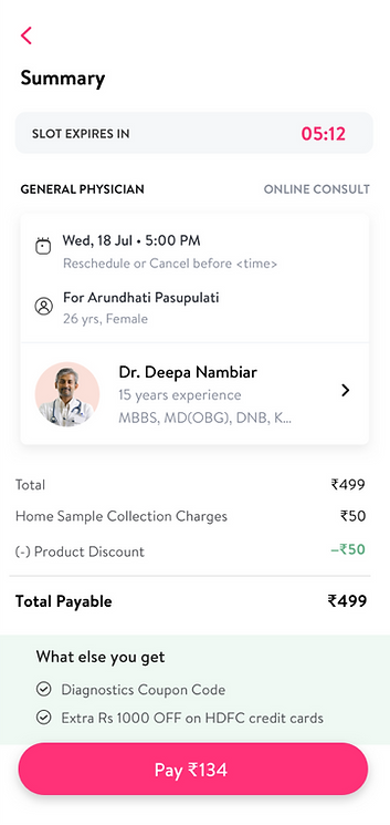
I balanced doctor and patient schedules through slot selection, notifications, reminders and rescheduling. Instant appointments and pay-later options addressed time-sensitive needs.
Patients could share X-rays, previous prescriptions and reports; doctors could send formal prescriptions after calls. HIPAA-related privacy considerations were design requirements, not a compliance certification.
03 / EVOLUTION
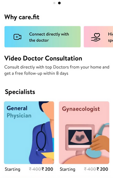
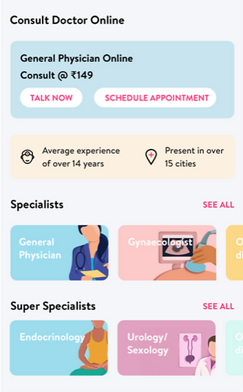
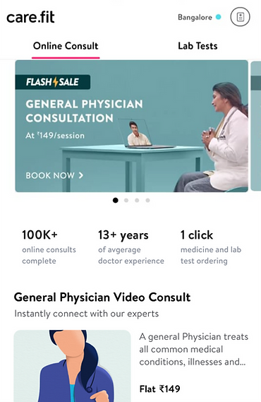
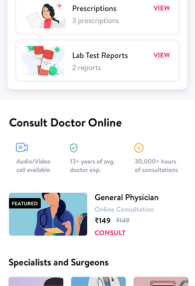
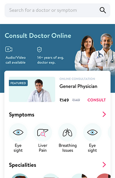
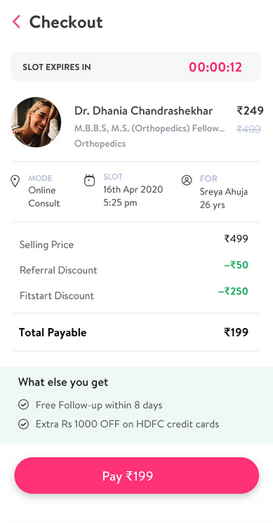
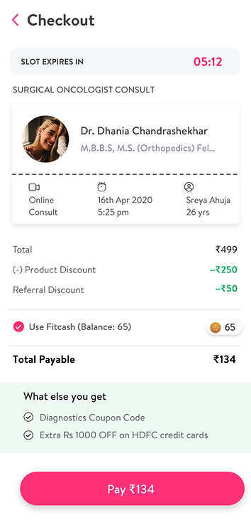
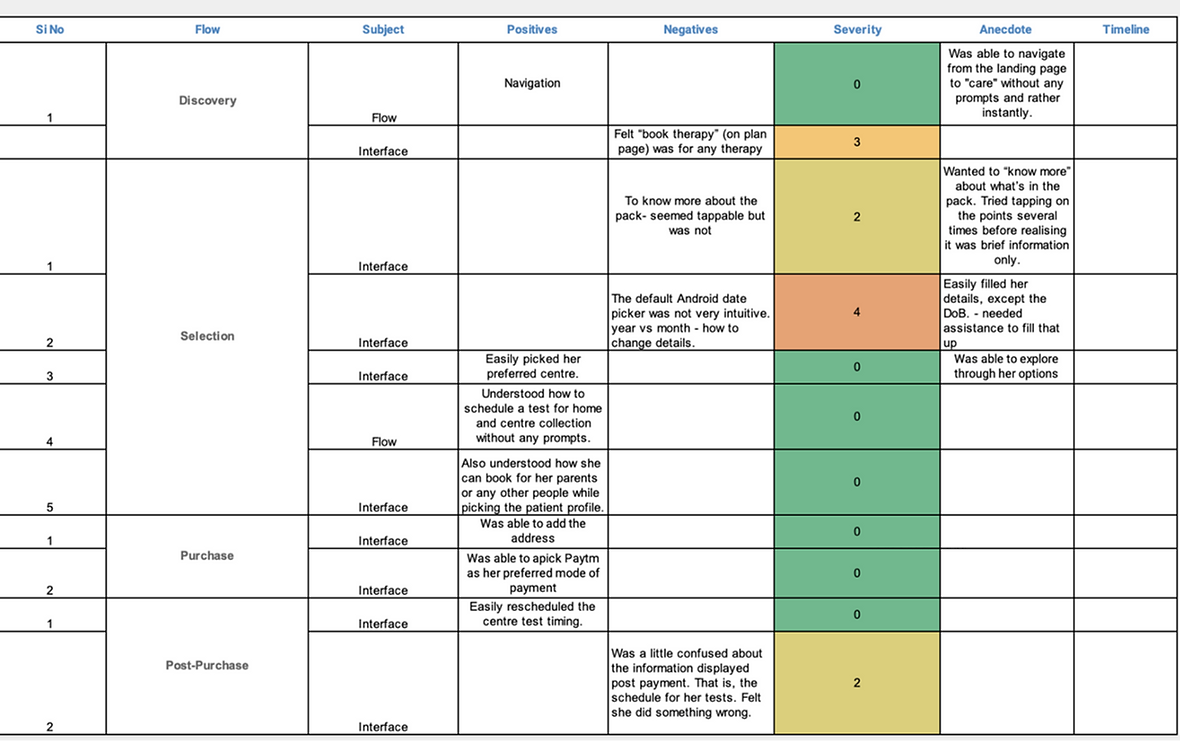
Post-launch usability studies and unmoderated testing guided my redesign, revealing unclear package details, a difficult date picker and confusion after payment.
I co-created speciality cards with a visual design studio. We A/B tested grouping and navigation, lightened visuals, clarified prices, and foregrounded trust markers and care history.
The explorations below show the range: large portrait cards, specialist groupings, a compact grid and lighter illustrated tiles.
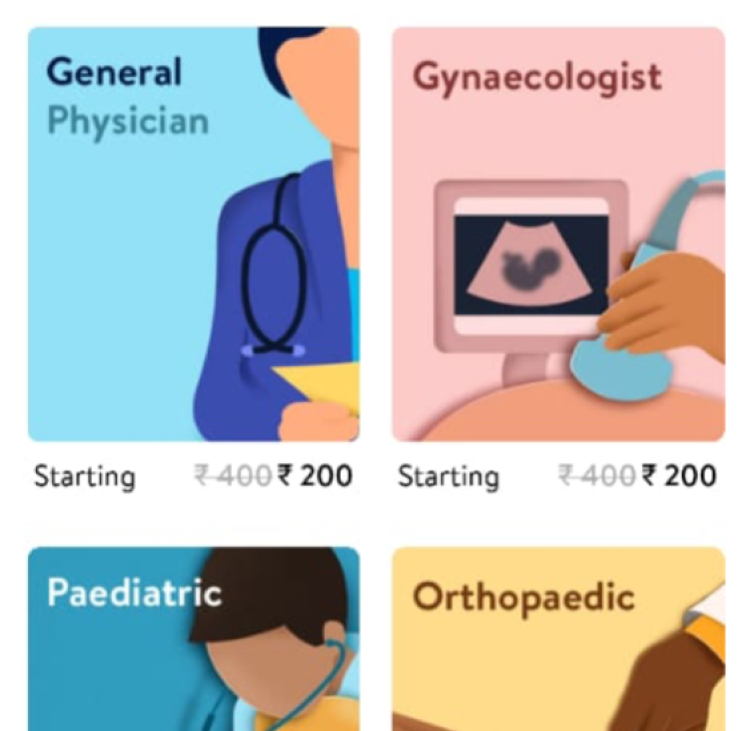
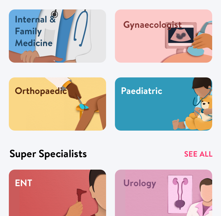
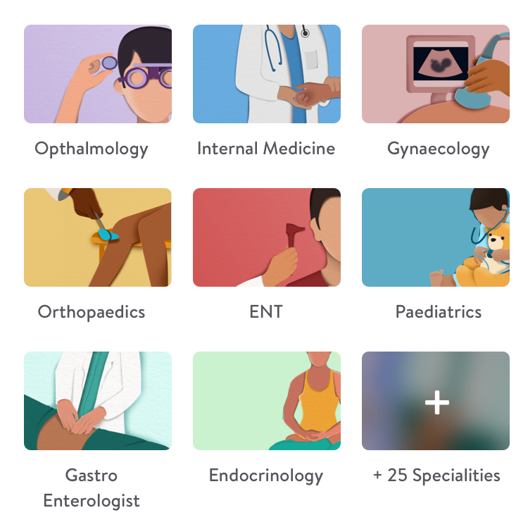

Four explorations in source order, not four confirmed releases. These are detail crops of the speciality grids.
04 / BEYOND THE CALL
Care also meant acting on a prescription, booking for family, returning to a doctor and getting support through COVID-19.
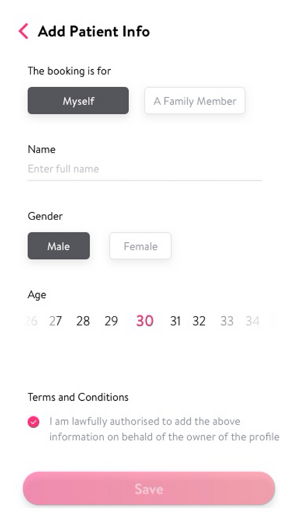
I designed multiple family profiles and booking for others, making the handoff explicit when the person booking wasn’t the patient.
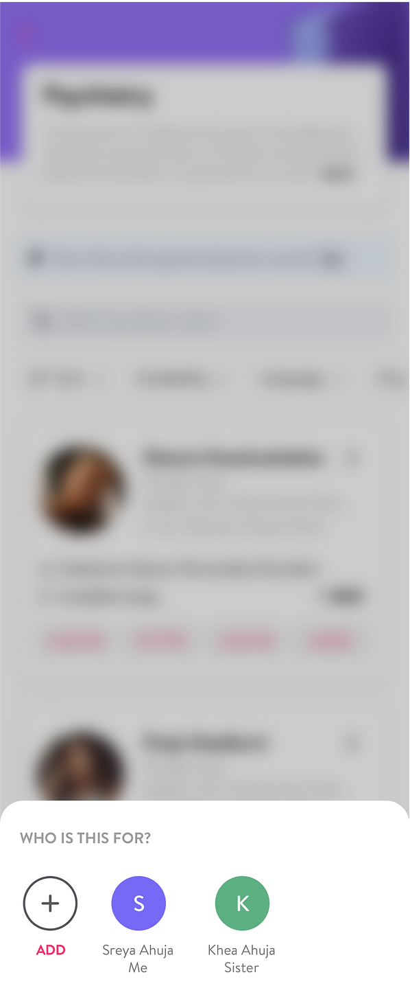
The picker lets people add a patient or choose a family profile before booking.
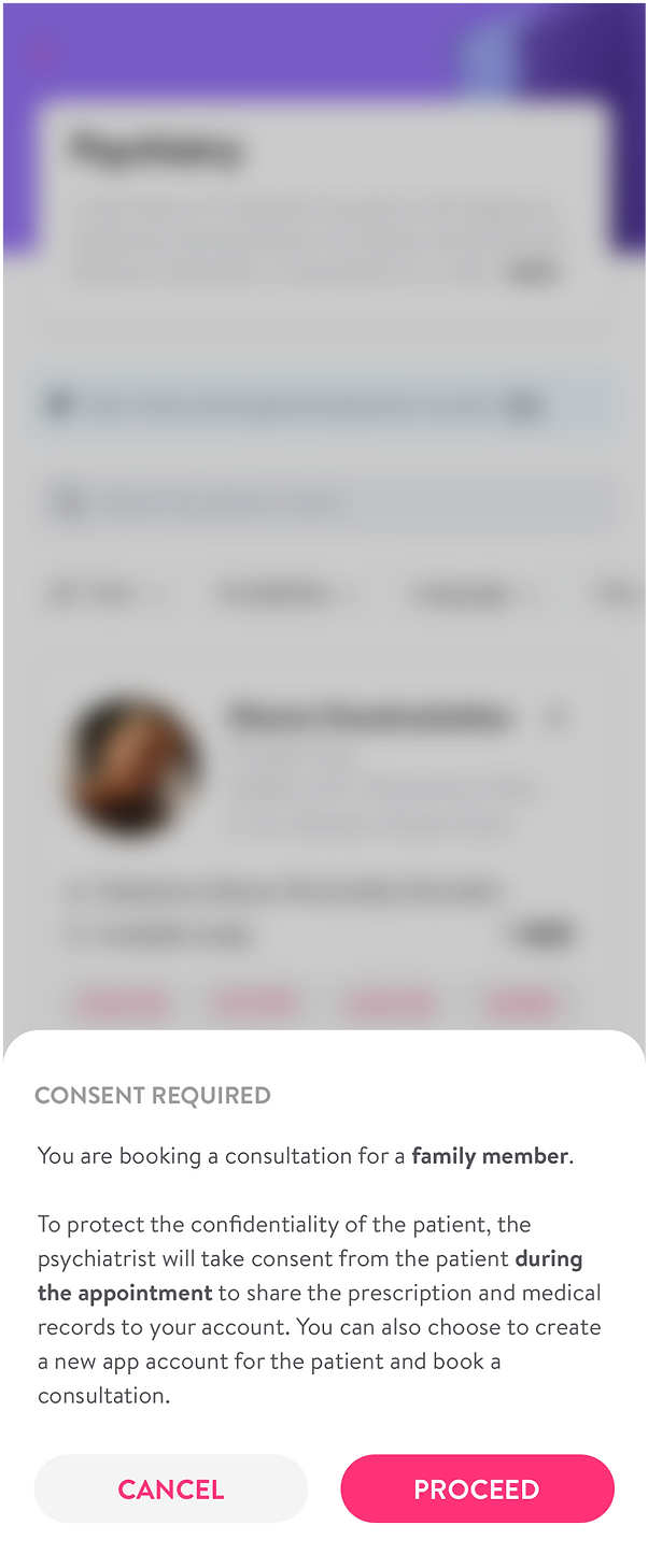
For psychiatry, I made consent explicit: the psychiatrist would ask the patient during the appointment before sharing prescriptions and medical records with the booking account. The prompt also offered a separate patient account.
From one consultation, patients could take two practical routes: arrange tests or order prescribed medicines. I connected the prescription to those next steps, including the real-world handoffs that followed.
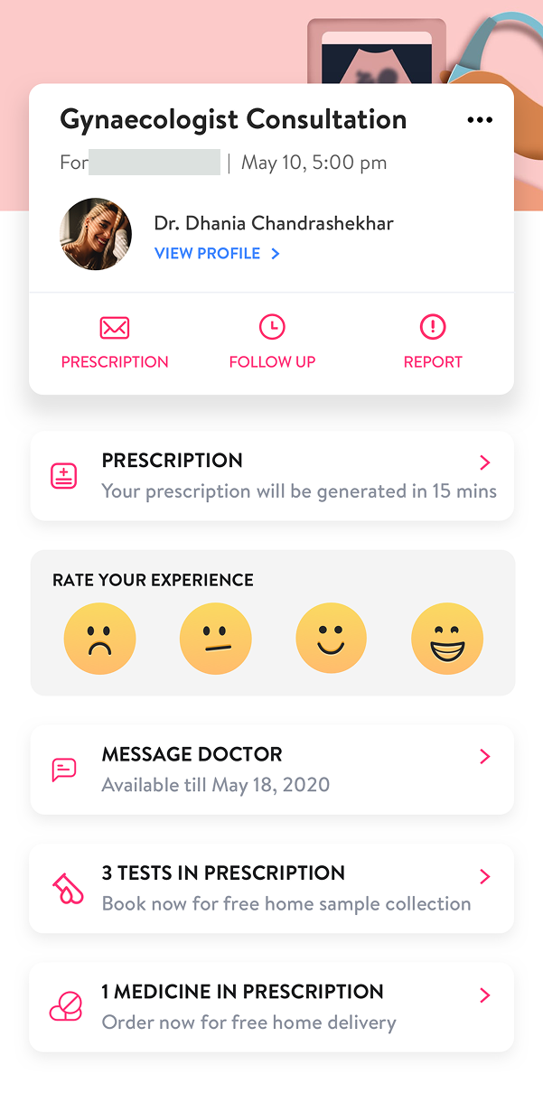
01 / THE HANDOFF
The summary brings prescription status, follow-up and messaging together. Tests and medicines in the prescription each have a direct route into booking or ordering.

02 / CLINICAL CONTEXT
The prescription retains the clinical context alongside the care plan. Recommended tests, follow-up and specialist referrals have their own actions instead of ending as a static document.
Scroll inside the phone to read the full prescription. Select the screen to open it larger.
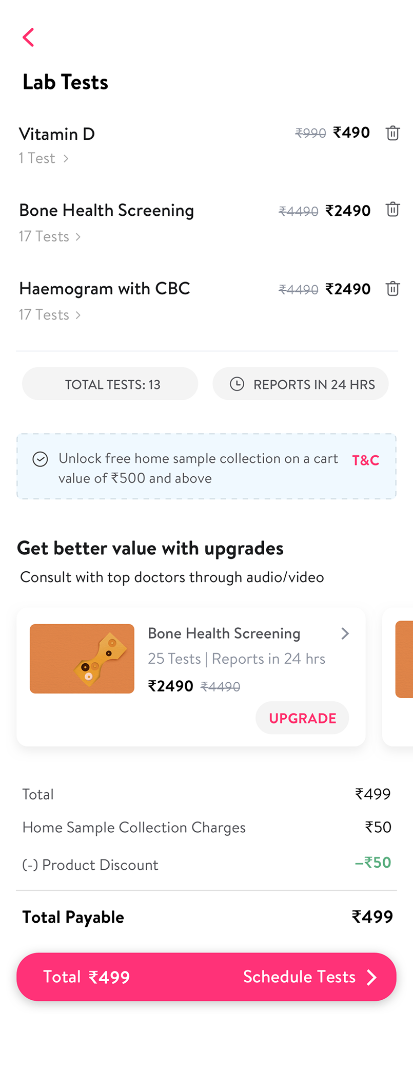
03 / ARRANGE TESTS
A-la-carte diagnostics offered an alternative to bundled check-ups. The cart shows selected tests, report timing, optional upgrades and collection charges before the patient schedules a visit.
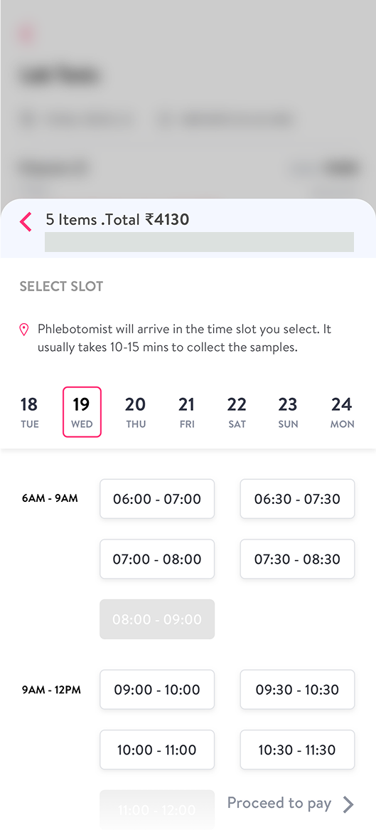
04 / THE HOME VISIT
Date and time windows make sample collection explicit. Unavailable slots are disabled, and guidance about the visit sits close to the selection.
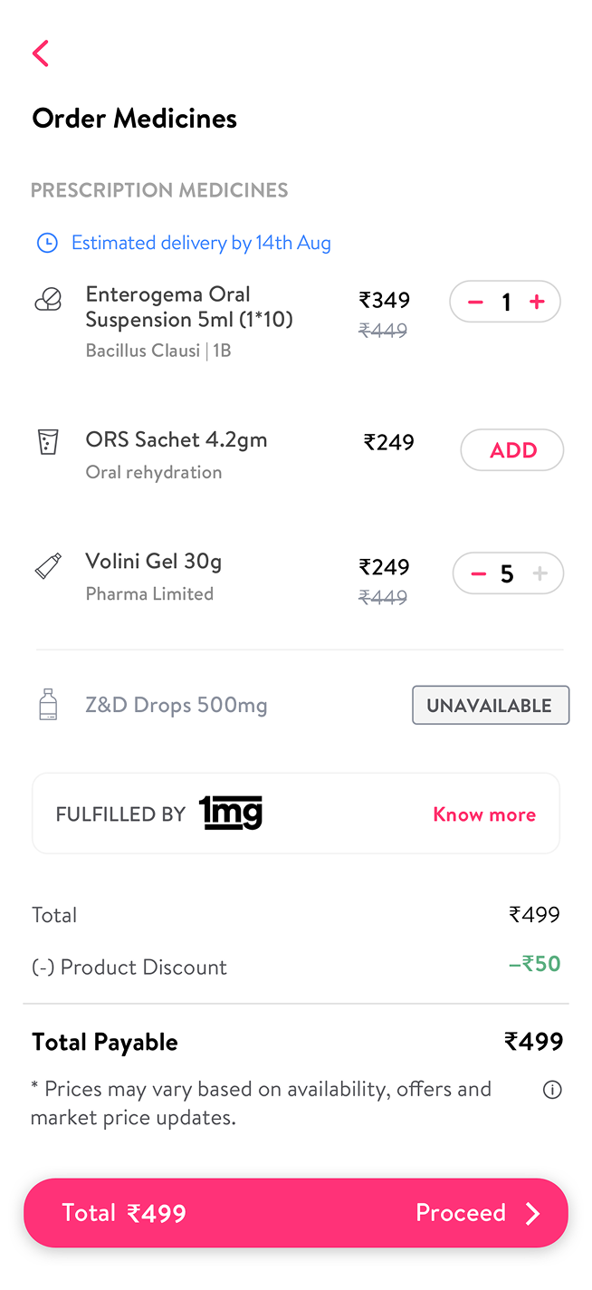
05 / ORDER MEDICINES
The medicine route starts from the consultation, then shows quantities, prices, stock availability and the fulfilment partner before proceeding.
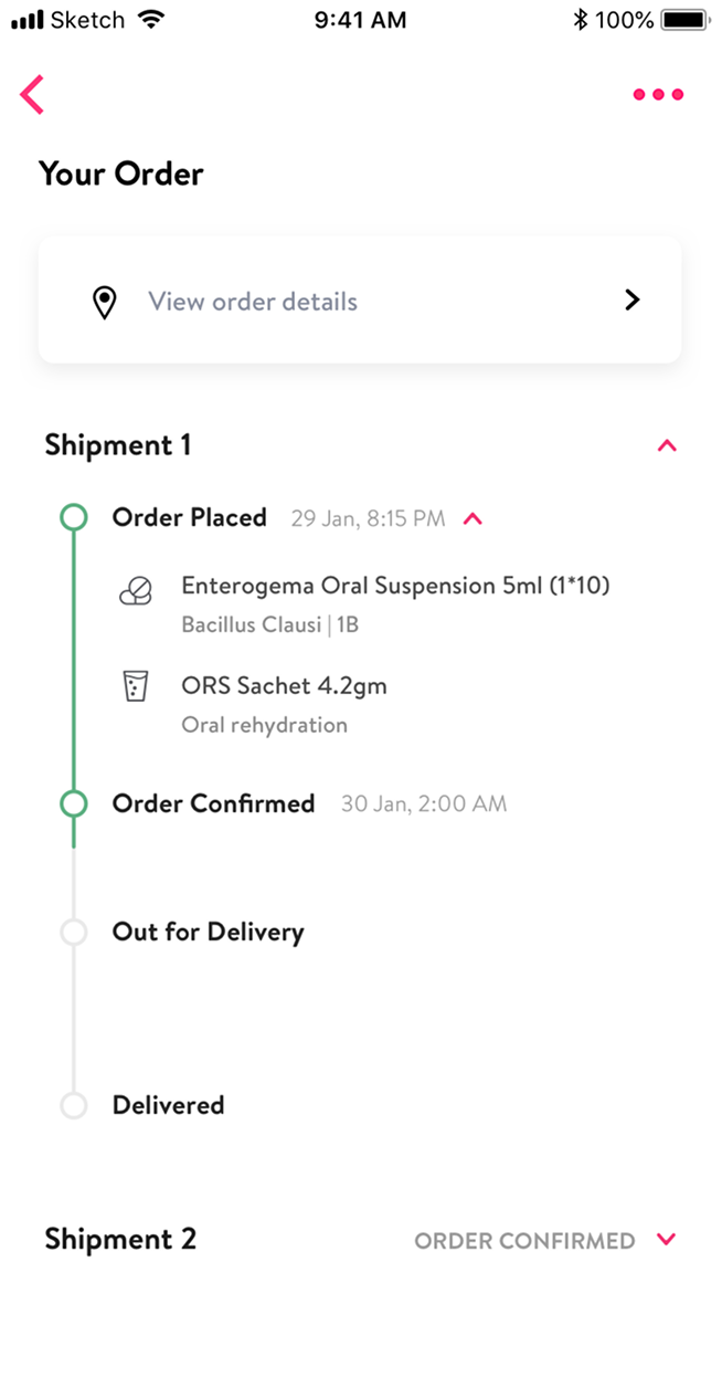
06 / FOLLOW THROUGH
Order tracking distinguishes placed, confirmed, out for delivery and delivered, including split shipments. The next part of care has its own visible status.
These screens show the diagnostic and pharmacy branches of aftercare. Personal details are masked.
I brought active and recommended care, previous doctors and records together. The My Care explorations show how each part could open up without sending patients to a separate corner of the service.
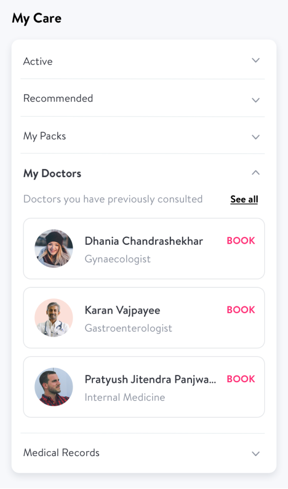
01 / FAMILIAR DOCTORS
Previously consulted doctors have their own place in My Care, with a direct booking action rather than a fresh search.
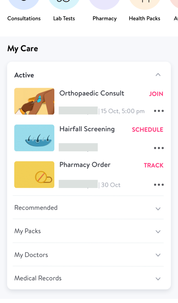
02 / WHAT’S IN PROGRESS
An active consultation can be joined, a screening scheduled and a pharmacy order tracked. The action changes with the service, not just the label.
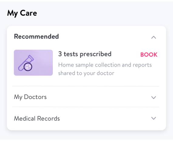
03 / WHAT COMES NEXT
Prescribed tests sit beside a booking action and explain the next handoff: home sample collection and reports shared with the doctor.
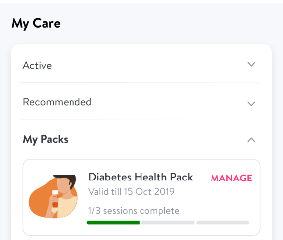
04 / CARE OVER TIME
Health packs show validity and completed sessions alongside a management action. Ongoing care needs a sense of progress, not only another booking button.
Detail views from the My Care exploration, not a sequence of release versions.
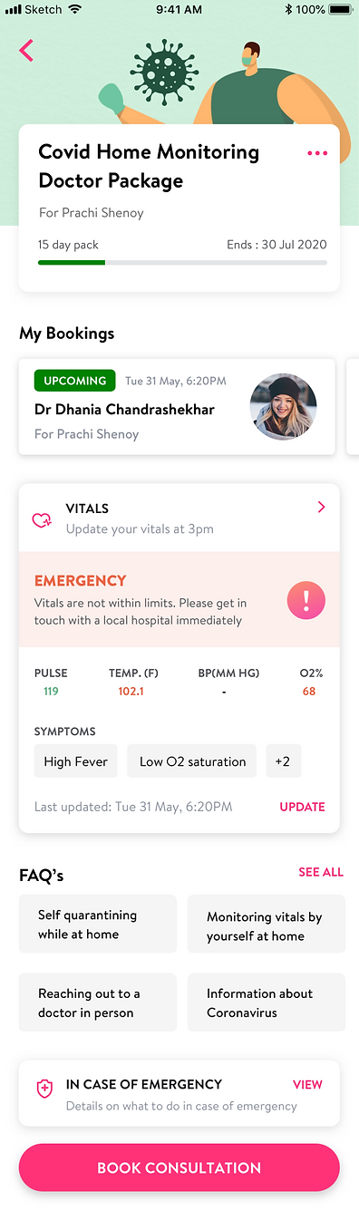
I designed COVID-19 consultations, monitoring and treatment with essential equipment access, instant appointments and pay-later options. Monitoring kept bookings, vitals and follow-up together.
05 / REFLECTION
Healthcare is a chain of handoffs. I learned to design discovery, trust, clinical context and follow-up together.
We prioritised launch speed. I would make more room for research and information architecture, and better isolate each design change’s effect.
A DIFFERENT KIND OF COMPLEXITY