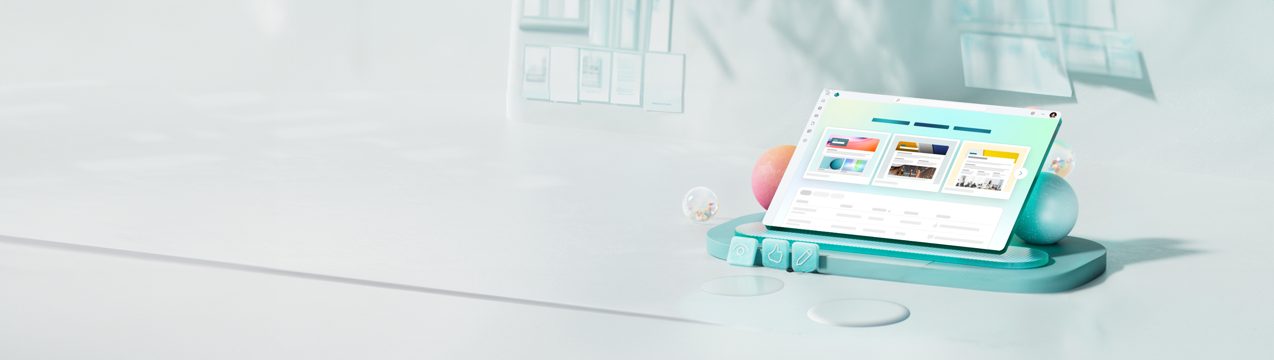
Find what matters.
Read company news, find a team site and reach the documents needed for work.
Some interactions could not load. The full story and navigation links are still available.
MICROSOFT SHAREPOINT START / 2023-2024
Turning SharePoint’s front door into a place to create, not just find content. I joined a stalled initiative to connect the experience and shape a first version we could ship.
Monthly active Start users by October 1, 2024.
Of Start’s monthly active users creating artifacts.
Reported publishing reliability, up from roughly 90%. All P1 scenarios stable.
01 / THE CONTEXT
SharePoint connects sites, pages, news and documents, supporting teamwork and organisation-wide communication. Its users arrive with very different jobs to do.
Read company news, find a team site and reach the documents needed for work.
Create pages and news posts, share updates and keep published content useful.
Organise sites, manage access and help information reach the right people.
These roles overlap: today’s reader may be tomorrow’s creator. Creating a page means deciding where it belongs, who can see it and who can manage it. Sites, navigation and permissions connect those choices.
Start was an entry point into this system, not a standalone creation tool. A creator-first experience still had to preserve familiar routes to existing content.
Months of work had not converged on a launchable V1. The primary journey, templates, publishing, permissions, navigation and measurement still needed a shared model.
Feedback from 12 MVPs also raised creation governance and confusion across Microsoft 365, OneDrive and Start landing pages. I needed to connect those decisions.
02 / THE RESET
Within my first week, I established a creator-first job, a focused V1 and a cross-functional structure for making decisions.
In a comparative study (n=70), a majority preferred intent-based templates to a prototype organised around Sites, Pages and Newsposts.
I centred V1 on creating useful content and reaching people, rather than choosing a site first.
Wayfinding research showed people using bookmarks, Teams and Viva Engage to find news and sites. Those habits mattered. Finding content remained a secondary job, rather than disappearing.
Let people create before choosing where the work will live.
Bring drafts and published pages into the same management experience.
Support personal or selected-site publishing, with email and sharing paths.
A SHARED WAY TO DECIDE
I defined two principles to align the team around the creator, giving us a shared way to judge the details.
A modern palette, secondary accent and intent-led layouts gave the main value proposition room to breathe. Well-crafted templates made the possibilities tangible, instead of asking people to imagine an empty page becoming useful.
Put templates front and centre, with intent-based filtering to make starting easier. Walkthroughs, draft thumbnails and a clear next action helped people begin, return to their work and create with confidence.
03 / THE DESIGN
I worked hands-on across interaction, content, onboarding, templates, management, publishing and sharing. These choices turned the model into a usable first version.
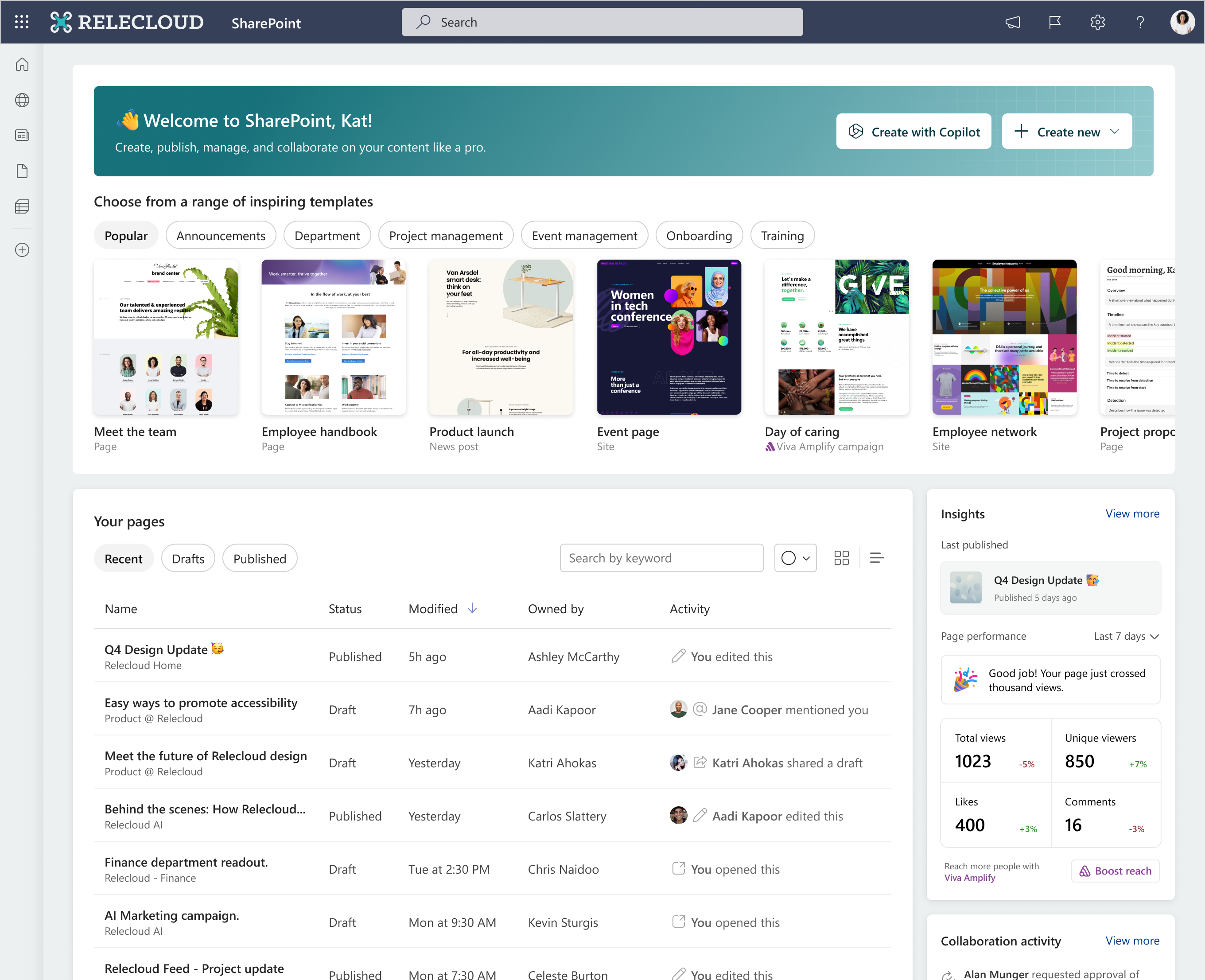
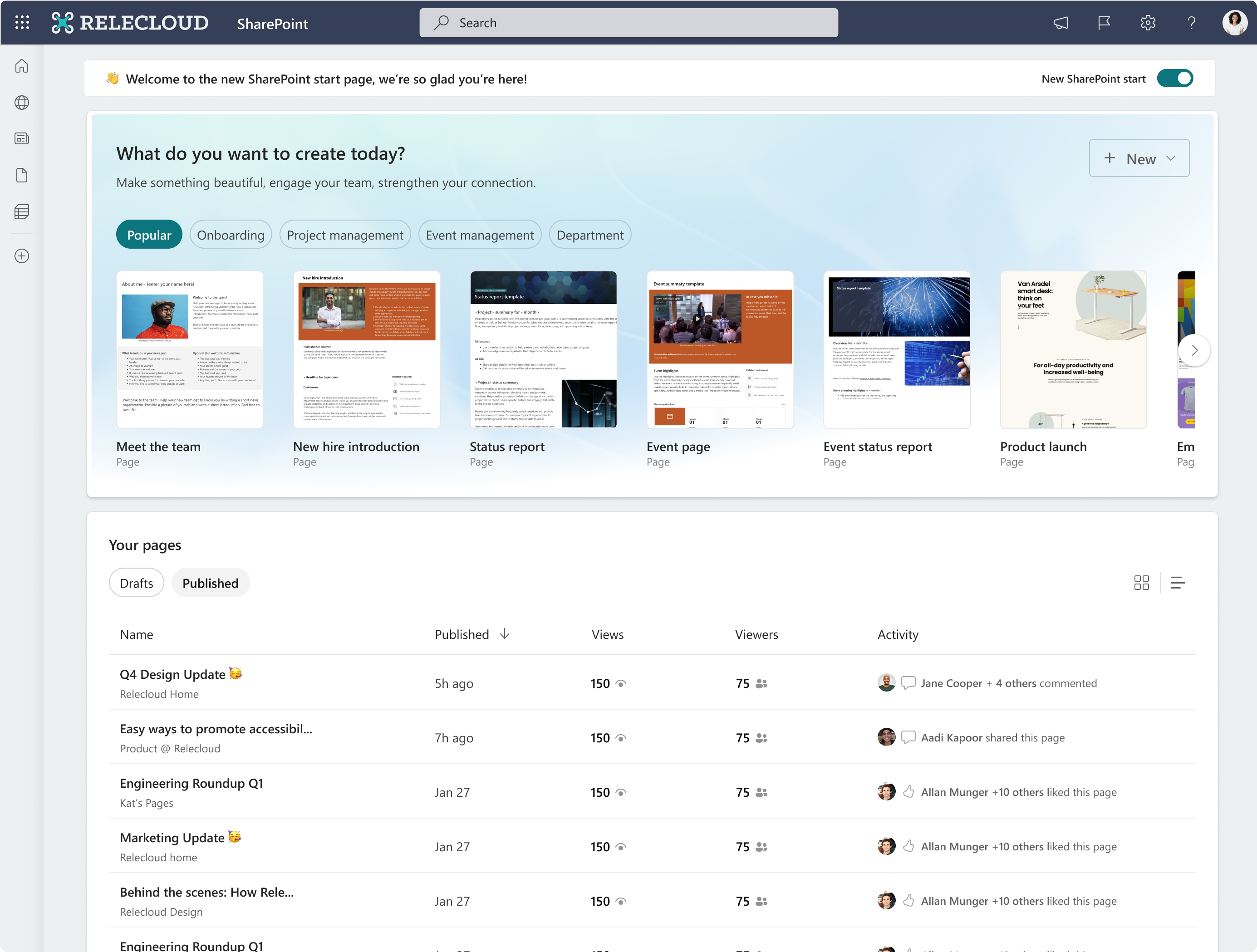
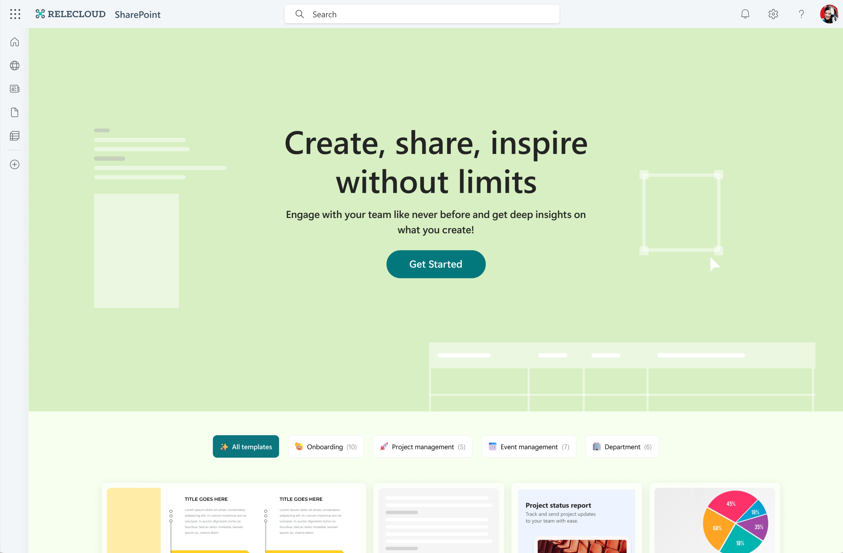
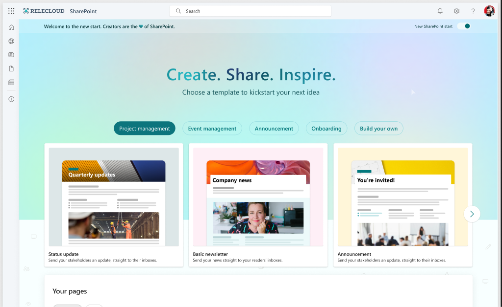
I designed creation and onboarding so people could begin without selecting a site. The destination became a publishing decision, not the price of getting started.
A thumbnail had to help someone recognise the job, anticipate the page and feel ready to begin.
Customer feedback prioritised project management and company announcements, then onboarding and event management. I started with those intentions, not the artifact label.
I compared inspiration-led, intent-led and balanced treatments. The direction moved between two needs: an inviting first impression and a predictable page structure.
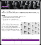
Faithful to the page, but dense text and imagery become hard to scan. A miniature screenshot was being asked to explain both the purpose and the composition.
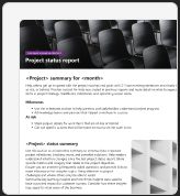
A stronger first impression, with less of the overall structure visible. Bringing the page closer made it more inviting, but hid what came after the first section.
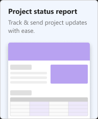
Hierarchy is easier to scan, but replacing photography loses character and context. Simplification helped the structure; it did not need to erase everything that made the page feel real.
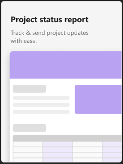
More expressive, less predictable. Inspiration could not replace information about the layout. Studies with and without text clarified the split: words explain the purpose; imagery suggests the composition.
Keep real imagery and recognisable sections; turn dense body copy into lines. A clear label signals intent, while hover reveals sections below the fold, their order and the mix of text and images.
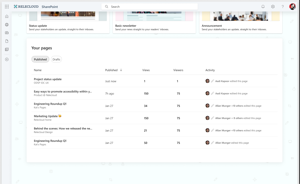
I brought drafts and published pages into one management view, connecting creation with the work of returning, updating and publishing.
V1 supported personal or selected-site publishing, email-ready pages, email distribution and sharing. I worked through those interactions and their underlying permissions and content hierarchy.
04 / VOICE & MOTION
The principles shaped the words, visual rhythm and first seconds of Start. They were part of the experience, not a final layer of polish.
Successfully shared over email

Link successfully shared

No published pages
No draft pages

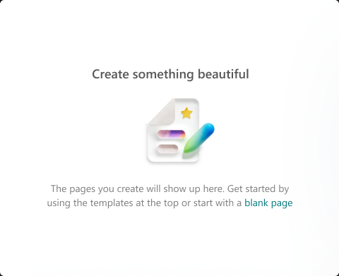
Create something beautiful
Moving in progress

00% complete
Successfully moved
Your page is taking a bit longer to move
I defined a human, non-technical and confident voice to reduce anxiety and make the experience understandable.
The copy describes what someone can do, not the product model: “Create. Share. Inspire.” is the invitation; “Choose a template to kickstart your next idea” is the next step.
Tone still depends on the moment. An empty state invites a first attempt. Frustration needs clarity and reassurance, not the enthusiasm of a celebration.
Defining the illustration set for Start was a big win. I brought the Musea language into empty states, progress, delays and confirmations, so the words and imagery could work as one experience rather than a collection of unrelated messages.
TWO LAYERS, TWO DIFFERENT JOBS
The thumbnail scroll reveals more of a template before someone chooses it. It responds to their interaction and returns when they leave.
The colour field and moving headline bring the entry point to life, without replacing useful information or competing with controls.
Five overlapping shapes blend a 60/30/10 palette of neutrals, secondary accents and brand teal into a quiet background.
Blur at source scale: 200px on one shape, 300px on the other four.
The shapes turn along a repeating 12-second path.


05 / THE TEAM
I led through influence, aligning stakeholders across functions, geographies and seniority without a formal reporting line.
Across repeated review cycles, I anchored decisions in the creator’s primary job, V1 scope and dependencies. Making tradeoffs explicit helped turn competing priorities into decisions the team could execute.
I set up shared workspaces and cross-functional reviews while staying hands-on with the experience. Connecting navigation to hierarchy and publishing to permissions kept the product decisions grounded in the end-to-end journey.
06 / REFLECTION
Moving between the product’s purpose and its smallest choices. A focused V1 became real when entry, templates, management and publishing told the same story.
Who returns to create, where work stays unfinished, and whether publishing and sharing make sense across organisations. Getting someone started is only the beginning.
MORE STORIES ABOUT CONNECTING THE EXPERIENCE